
Website
ORCA
ORCA provides a public transit card that can be used for buses, trains, and ferries in the Puget Sound region of Washington State. This card provides a variety of service options from low income to monthly business passes.
Role: UX Writer
Company: ORCA / Student Project
Time: 2019 / 5 Weeks
Team: 1 UX Writer
Tools: Illustrator, Photoshop, Developer Tools
challenge
How might I make it easier for orca.com members, to add money to their card through the website?
The ORCA site is outdated and underfunded. I wanted to evaluate the current users for the site and how I could improve their processes keeping in mind budget and overhead.
research
Initial Analysis
I conducted user research to define accessibility standards and voice for ORCA.

Initial accessibility Theories
Information is disorganized
Language is not at a universal reading level
Links are mislabeled
Voice Analysis Takeaways
Content is over explained and confusing
Content is phrased in businesses terms and not in the users language
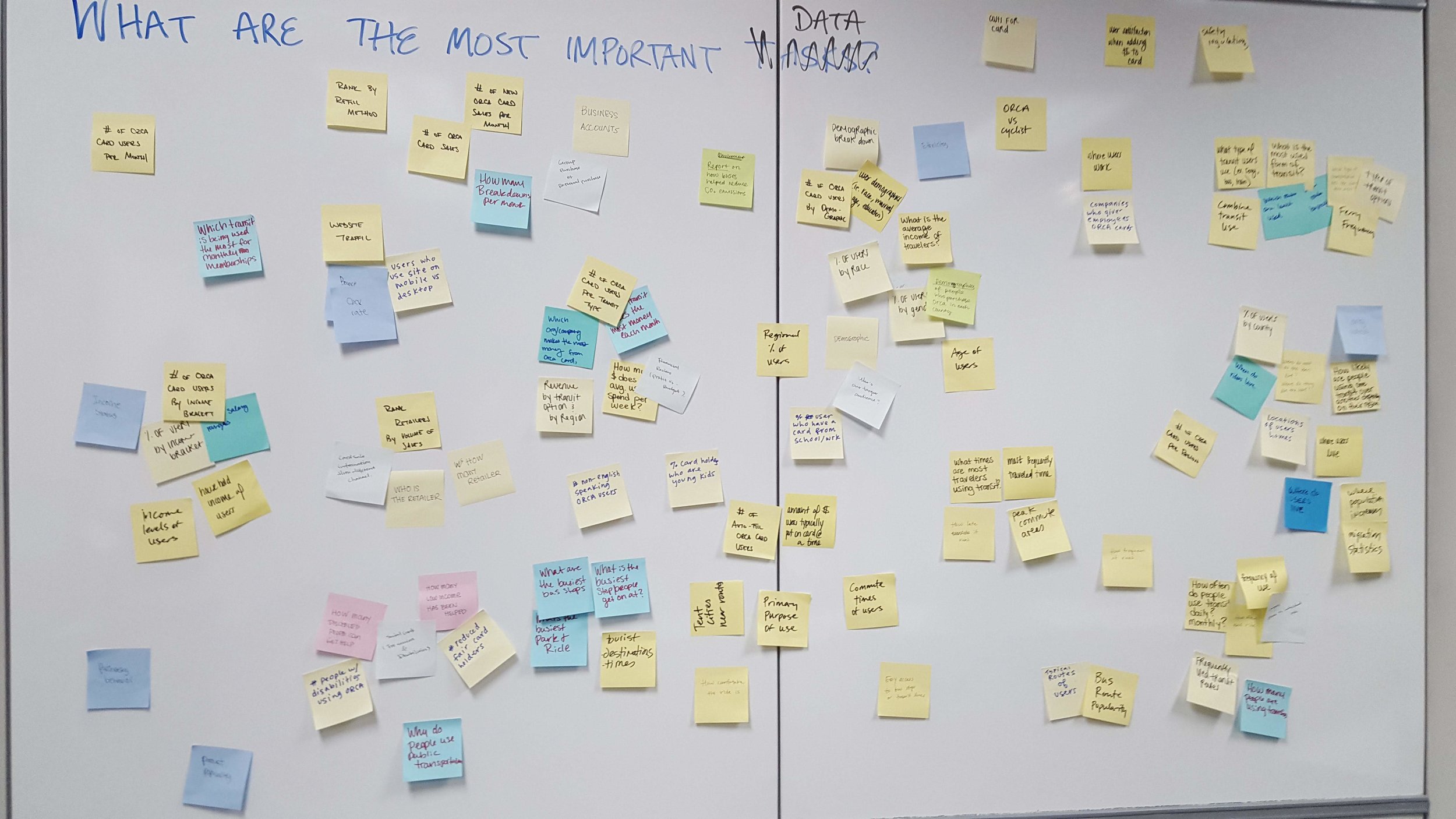
What I wanted to learn
Who uses ORCA
Where they are getting on/off the bus
What are the most frequented stops
How people talk about riding the bus
What services does ORCA provide
What frustrations people have using the ORCA website
Defining the users
The public transit system in the Puget Sounds has a variety of users. I chose to focus on people with different needs, people who aren’t driving, and low or no income users. This includes people with disabilities, non-English speaking, vision impaired, homeless, and even tourists. I focused on voice and accessibility. These users face the biggest obstacles using the site.


Development
Defining the voice
Getting the voice right can save users tons of time and frustration and even make them perceive the business in a different light. Here I defined the voice guidelines from the keywords the company wanted to portray. Then I applied them in three different ways to understand what works best for ORCA.
Voice Guidelines

Voice Guidelines Applied
Clear
Efficient
Trustworthy
flow Testing
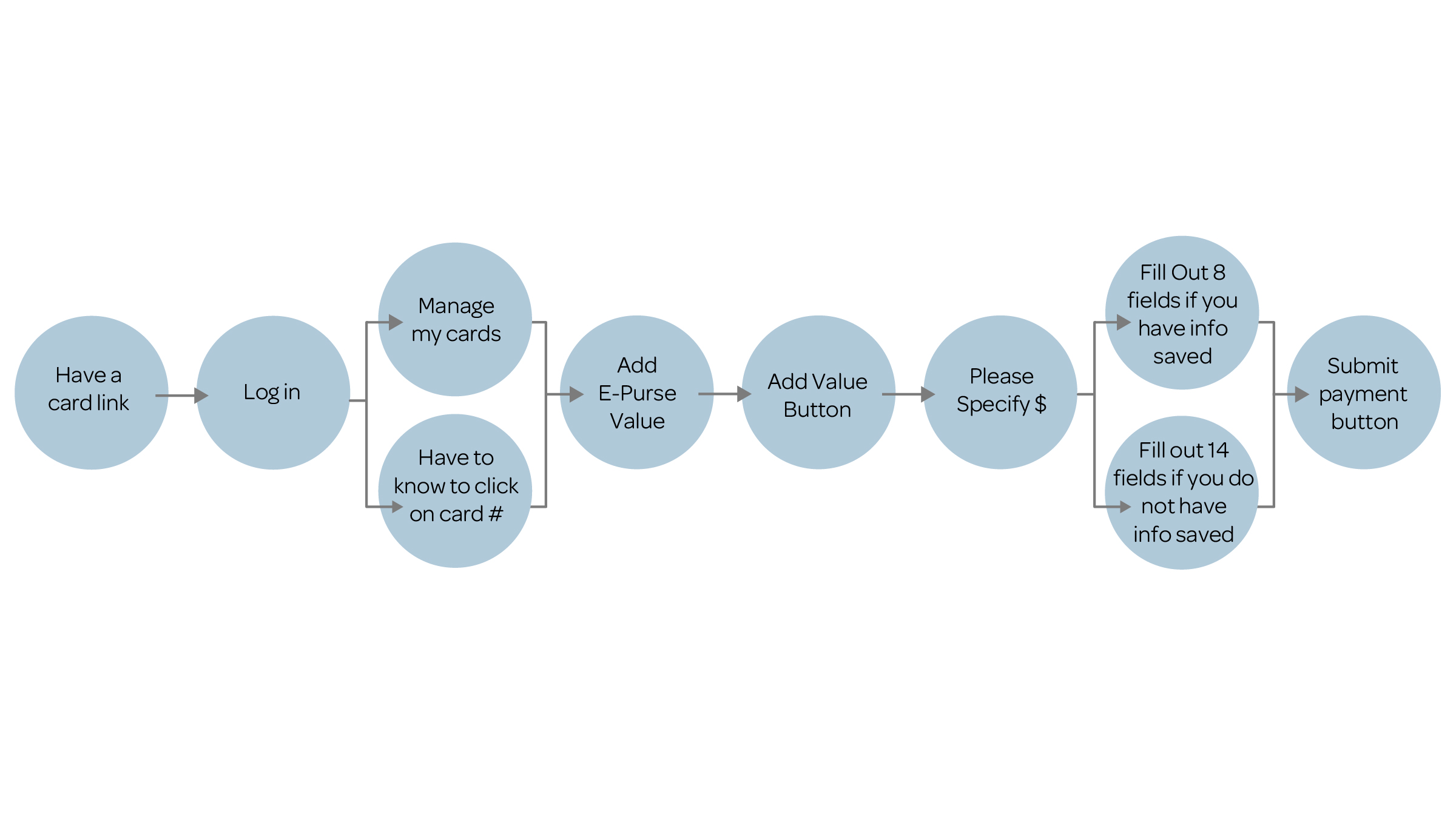
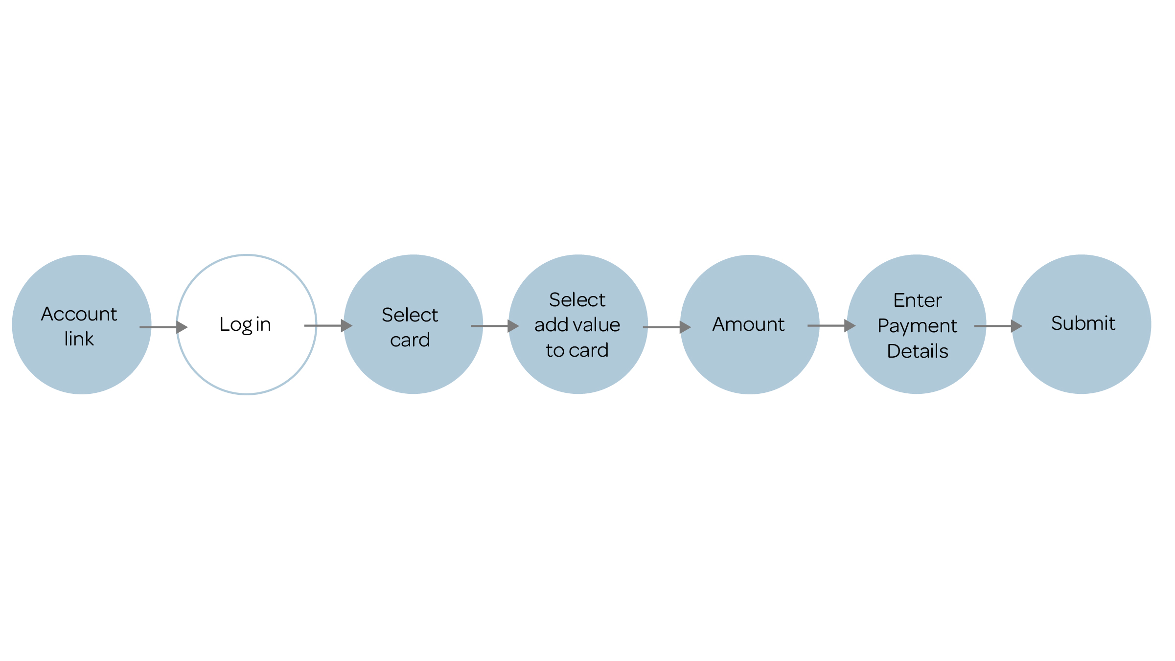
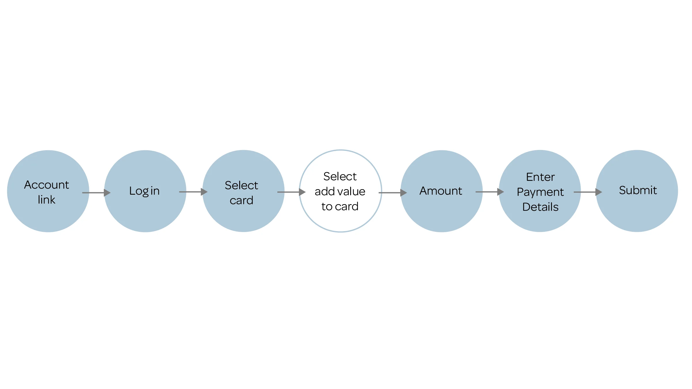
The direct path
Because of time constraints, I conducted secondary research for this project. I reviewed the current user flow to see where value could be added. I updated this to be more efficient by providing a clear path to take that’s easier to understand. I focused primarily on the home page, navigation and rewriting the flow for customers to add money onto their card through the site.
original flow
ideation

updated flow

SOLUTION
ENGINEERING TAKES TIME…
Writing is quicker and cheaper to implement. By addressing the writing alone of a website, users can have better experiences with products while gaining some wins for the business, and all of this with a low overhead cost
Original homepage

Here I focused on the navigation, the intro bullet points and the pdf links at the bottom. The language is in the businesses terms instead of the users. The language was not accessible.
NAVIGATION
Have a card is confusing, it is now more accurate and actionable as “Account” because that is where the link takes you.
“Get a card” was appropriate language and leads you to all the options of getting a card. It also cannot be “buy a card” because there is certain eligibility to receive free cards. I did change the the text to title case for all of these links to make them appear more professional and trustworthy
“ORCA options” doesn’t tell the user what kind of information they will find by clicking on the link. “Use A Card” is more accurate.
I removed ORCA from the nav to clean things up. A user on the site already knows they are looking at ORCA options so restating it is redundant.
FAQ is not accessible to people who don’t speak English as a first language. Changing this makes it easily translatable.
Home Page

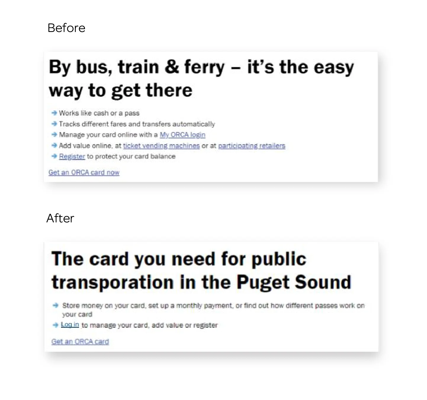
By clearly describing what the card does, the title is more accurate and and trustworthy
Consolidated information into one sentence
All lines are for the PDF’s below
Specifically for the add value problem I made sure to add this to the home page
Here I focused on making things clear.
Adding value can be done offline but this is not clear.
Retailers is not descriptive enough. The PDF represents the locations you can add value or buy a card offline.
Ticket vending machines is also confusing. This PDF is actually telling you the locations you’re able to buy or add value to your card.
Product list is a business term. I’ve changed this to Fare Options, as it telling you about pricing.
A new customer coming to the site would not know what an E-Purse or a pass is. This PDF also tells you about more options than just those two services.
The last PDF is actually an application which is very important for users that need to apply. It is not clear in the before that this is where you can obtain this information.

Account Page
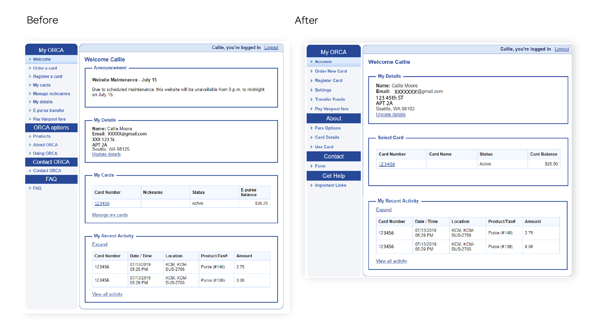

These three areas are already on this page and were removed for redundancy
“E-Purse” is a confusing term, shorten this to “Transfer Funds”
“Products” is a business term, changed this to “Fare Options” as the link leads to all the options to add fare.
FAQ is not accessible and does not translate well. “Get Help” is more informative and “Important Links” tells you where this link will lead to
I changed “My Cards” to “Select Cards” to make the process more actionable.
”Nickname” has been simplified to “Card Name” and E-Purse Balance has been changed to “Card Balance” to make them more accessible.


Most of the information here is redundant and too busy for most people to read.
I shortened the text to only what is necessary.
I’ve removed “E-Purse” and changed this phrase to “Card Balance” and “Add Value” so there is less confusion surrounding it.
“Setup Autoload” has been changed to “Automatic Payments.” People understand what automatic payments are.
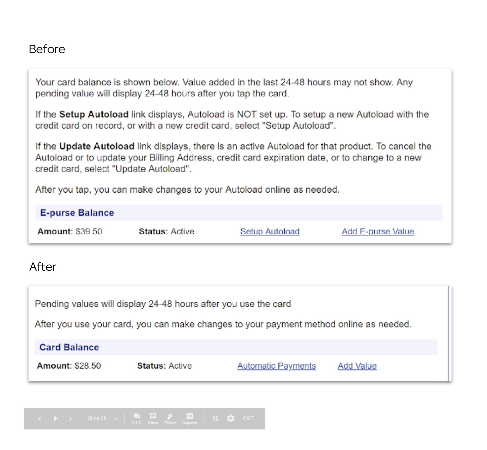
I have removed the unnecessary text and business language to simplify the page.
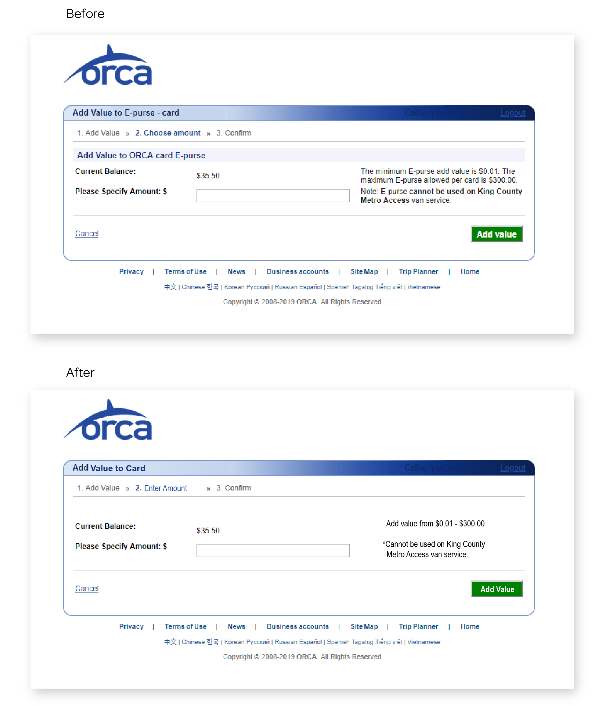
I changed “choose amount” to “Enter Amount” because you cannot actually choose an amount.
I’ve also added the correct tile

Condensed all the sentenced into bullet point in the same location. Removed “Shopping” and “Shopping Cart” as you are not shopping for anything, you are adding value to your card. Changed “Fees/Charges” to “Amount” because the tone should be about the customer adding value not the company applying fees. Changed all business language to more helpful language.
Results

Less jargon
Efficient statements
Information is condensed and easier to find so customers will be less likely to abandon tasks
Brand is seen as more trustworthy because links take you to accurate pages or files
The need for customer service is reduced which can allocate funds to other areas
next steps
Continue Writing
The next steps would be to look into additional user flows and update the writing along those paths. I’d also like to test with different types of users, including new and existing users, as well as English and English as a second language users.
