
Mobile + Desktop Website Design
TimeToc
TimeToc is a project focused on creating a new mobile and desktop site for a smartwatch and fitness tracker e-commerce site. This site is also used to help people make informed decisions about purchasing the right smartwatch to fit their needs.
Role: Research, UX Designer
Company: TimeToc / Student Project
Time: 2019 / 5 Weeks
Team: 1 UX Designer
Tools: Figma, Photoshop, Illustrator
challenge
Create a new site were people can purchase smartwatches and learn more about them.
For several people, a new smartwatch is a big purchase and they may not even know what information they would need. I wanted to decrease the friction associated with this learning curve.
research
Initial Analysis
I conducted competitor analysis and completed a site inventory.
Competitor Analysis Takeaways
Fitness trackers, hybrids, and smartwatches are almost always sold together, but the differences are not explained.
Users have different uses for smartwatches where it’s used because someone is into tech, fashion, health tracking, these watches go far beyond telling time.
People have to research more information about smartwatches on different sites then they buy them on.
Users want to compare pricing on different sites.
Brand of watch was important to users, especially the compatibility with their phone.
What I wanted to learn
What do first time buyers need to understand?
What features do people look for in smart watches?
How do people get help with a watch once they have purchased it?
Site inventory + Site Map
ideation
Sketches, lists, & notes
Making lists helps me think about problems and allows me to make sure i’m not missing anything. Sketching out the users journey helps me think about all the ways to solve this problem.
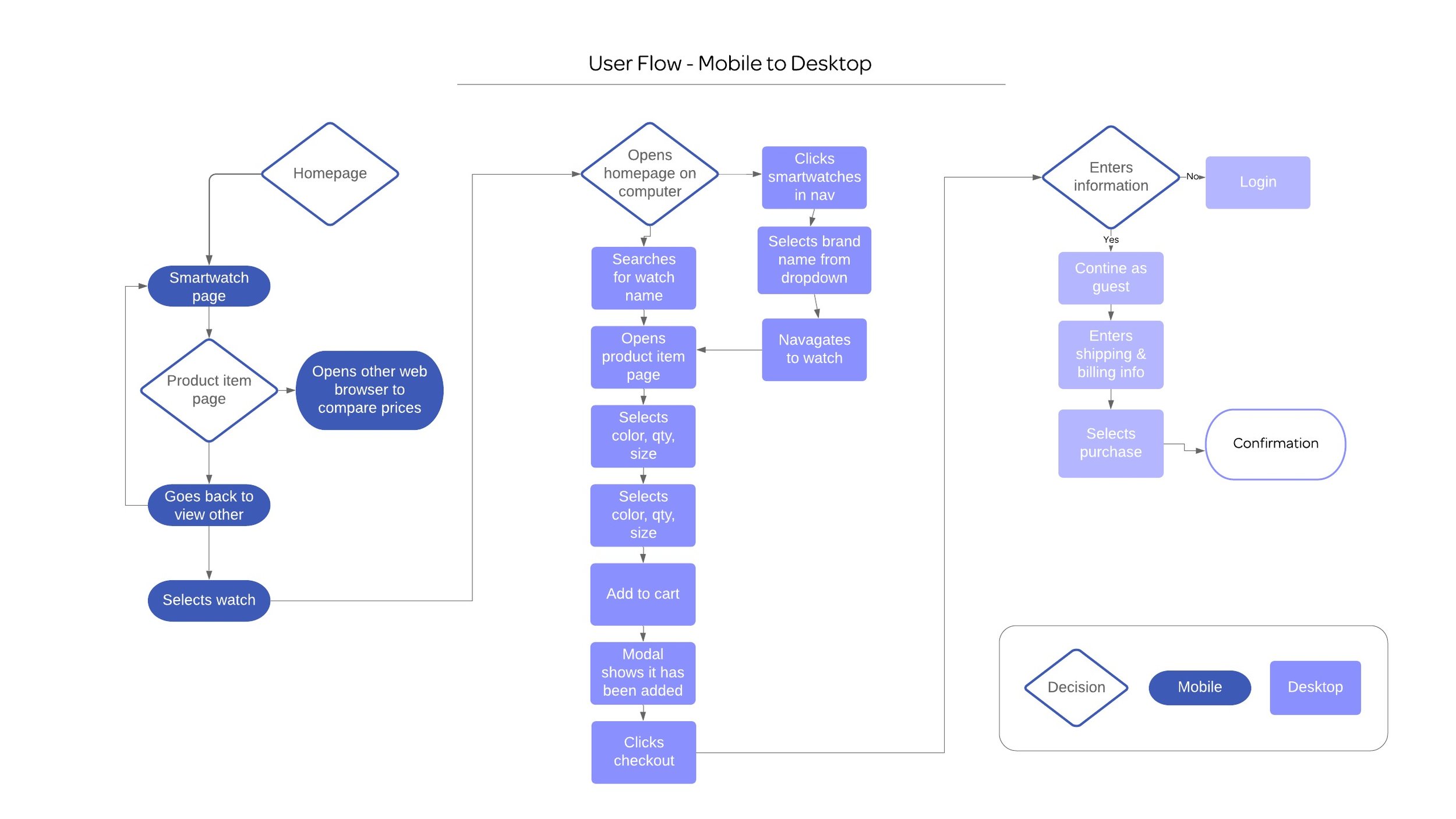
Solutions
Interaction
I focused on these main areas for this project on mobile and desktop.
home PAGE
Goal: Familiarize user with what type of products and information is offered on this site

Images are a prominent feature throughout the site, users once chose watches based only on style.
Top bar contains the shopping cart, search, & menu (navigation). Menu must be on right side for ease of use.
Click through to Product
Buying guide articles so users can find out which types are best for their needs.
Linked images that show different styles of watches
Additional styles of most popular watches.
Footer

category PAGE
Goals: Learn about what each watch offers. + Allow users to find out what they want or need in a smartwatch
Image of a featured watch
Large filer drop down, followed by a sort by option below.
Very Image based gallery, watches were once bought solely based on style, which is still prevalent, also with the filter set they won’t need to see all the features the watch has, until reviewing one watch
Expanded filter. This will be a prominent feature, needs to be very obvious and straight forward for the user as it will contain a lot of options. It is also all collapsible and check boxes and icons made bigger to use with a finger or thumb.
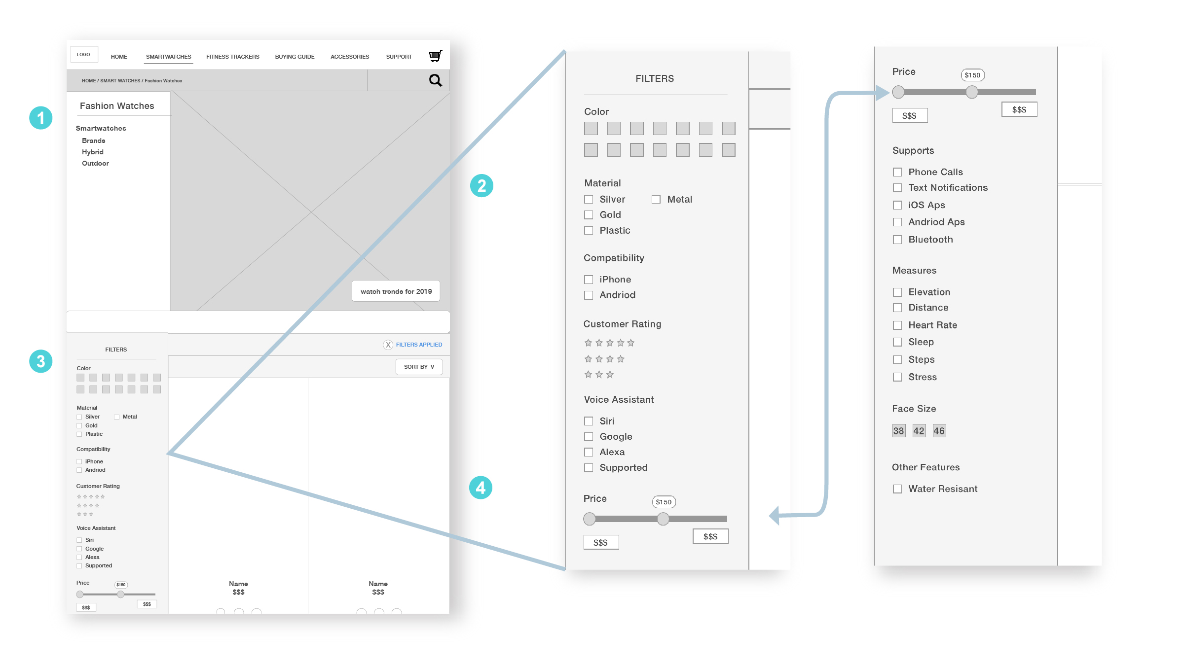
Image of a featured watch
Contextual side nav of the four categories of smartwatches. users can easily switch between
Left side Filter. This will be a prominent feature, needs to be very obvious and straight forward for the user as it will contain a lot of options Too many options to be able to place it on a horizontal bar.
Very Image based gallery, watches were once bought solely based on style, which is still prevalent, also with the filter set they won’t need to see all the features the watch has, until reviewing one watch The bar at the top of the products tells the user if they have filters applied making sure they notice the filtering options to the left, also includes a sort feature.
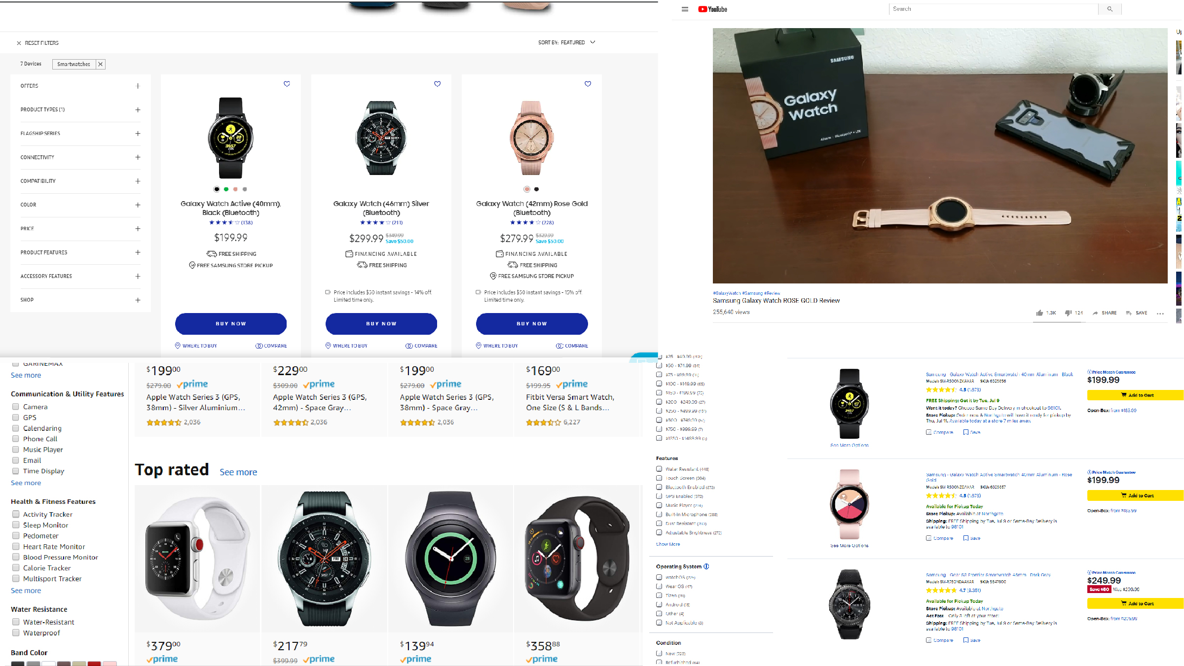
Product Detail Page
Goals: Tell users, in depth, about the watch without overwhelming + Get user to purchase
Title and minimal breadcrumbs to show the user where they are.
Image of product, with clickable views to the side of it being worn, the face, band, and any hardware.
Different colors the product is offered in.
Title, description, cost of product, and an add to cart button.
Menu that has 3 different states to allow users to view a lot of information. Features & specs will look the same but go into detail about things such as
battery life
Scroll through related items such as bands.
Support Articles
Reviews tab that shows UGC , reviews and star rating

Title and minimal breadcrumbs to show the user where they are.
Image of product, with clickable views to the side of it being worn, the face, band, and any hardware.
Different colors the product is offered in.
Title, description, cost of product, and an add to cart button.
Menu that has three different states to allow users to view a lot of information.
Scroll through related items such as bands.
Support Articles
Reviews tab that shows UGC , reviews, and star rating
Features & specs will look the same but go into detail about things such as battery life
Support Page
Goals : Help users fine the information they need. + Allow them to view information in a way they are comfortable with because they are likely already frustrated
The first wireframe is the overview page of the support topics you can look at
1. Search box
2. Commonly searched for articles
3. More exploratory support sections, consisting of titles, drop down and more link
The right wireframe represents once the user clicks through to a specific topic
4. Title of Article
5. Instructional Video
6. Scroll Through the steps with Images.

Title of Article
Instructional Video
Step by step instructions with images showing the step.
Contextual nav of related articles in case the user didn’t find exactly what they were looking for
More visual examples of related products
Footer containing social media icons, a newsletter signup and additional utility links.
Navigation
Goal: Help users find the information they need
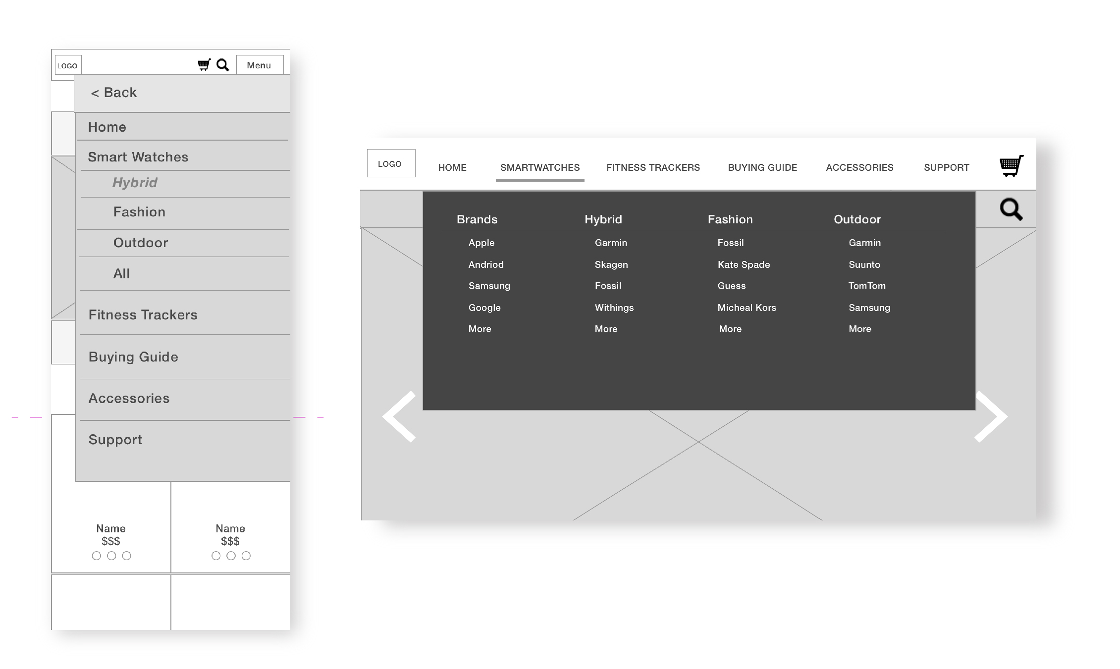
These are the views of the mobile and desktop navigation. The underline in the desktop nav shows “Smartwatches” is selected. Clicking on smartwatches would take you to all. These four topics were what people searched for the most and a lot base their decisions on the brand so underneath the four categories the brand is listed. Throughout the rest of the site their are breadcrumbs, page titles, and commonly related topics that act as contextual navigation.
Next Steps
I would like to create a prototype and test with users, especially the navigation and filters, then continue to develop additional pages,

